In today’s data-driven world, information overload is a significant challenge faced by businesses across different sectors. The fintech industry, in particular, generates vast amounts of complex financial data that can be overwhelming to comprehend and analyse. This is where the power of data visualisation comes into play.
According to a study, organisations employing data visualisation tools reported that 48% of managers can independently locate the required information without relying on IT staff. Moreover, a significant 74% of these organisations enable managers to make timely decisions by harnessing the power of data visualisation.
By transforming raw data into visually appealing and meaningful representations, data visualisation enables professionals to communicate insights effectively, making complex information accessible, understandable, and actionable.
Corestrat leverages data visualisation across its product suite, aiding users in gaining a comprehensive understanding of data and its implications. In this article, we will explore the significance of data visualisation in modern-day’s business while listing out some of the best data visualisation tools of 2023.
What Is Data Visualisation?
Data visualisation is the process of presenting data and information in a visual format, such as charts, graphs, maps, or interactive visual representations. It involves transforming raw data into visual elements that are more easily understood and interpreted by people.
The purpose of data visualisation is to communicate complex data sets, patterns, relationships, and trends in a visual and intuitive manner to support data-driven decision-making across various domains, including business, science, journalism, healthcare, and many more.
Why Is Data Visualisation Important?
Advanced data visualisation tools with predictive analytics capabilities have enabled organisations to identify trends and forecast future outcomes accurately. A study by TDWI revealed that 64% of organisations using advanced analytics, including data visualisation, reported better predictability of business outcomes.
Data visualisation is a powerful tool that helps us make sense of complex information by presenting it in a visual format. It enhances our understanding, facilitates data exploration, improves communication, supports decision-making, aids pattern recognition, enables data-driven storytelling, and helps monitor and track information effectively. It plays a crucial role in unlocking the insights hidden within data and turning them into actionable knowledge.
Here are some reasons why data-dependent organisations need data visualisation:
Data comprehension: Humans are visual creatures, and we often understand information better when it is presented visually rather than as raw numbers or text. Data visualisation allows us to see patterns, trends, and relationships in the data more easily, enabling us to comprehend and interpret it more effectively for risk management.
Communication and storytelling: Data visualisation is an effective way to communicate complex information and tell compelling stories. Data visualisation tools have enabled businesses to understand customer behaviour and preferences better. A study by Salesforce found that 67% of high-performing marketing teams are more likely to use data visualisation to better understand customer data.
By presenting data visually, we can convey insights and key messages more effectively to both technical and non-technical audiences. Visualisations make it easier to convey the main points, highlight trends, and support arguments with data-driven evidence.
Decision-making: Visualisations provide a clear and concise representation of data, making it easier to understand the implications of the information at hand. When making decisions, whether in business, science, or other fields, having a visual representation of data allows us to evaluate different scenarios, compare options, and make informed choices based on evidence.
Pattern recognition: Our brains are wired to recognise patterns, and data visualisation helps us identify patterns and trends in data more easily. Visualisations can reveal correlations, clusters, or other relationships that might not be apparent in raw data. This can lead to new discoveries, insights, and opportunities and help in predictive analytics for decision-making.
Monitoring and tracking: Visualisations are helpful for monitoring and tracking data over time. By visualising key metrics and performance indicators, we can quickly identify trends, changes, and deviations from expected outcomes. This enables us to respond promptly to issues or opportunities as they arise.
Principles Of Data Visualisation
The principles of data visualisation provide guidelines and best practices for creating effective and impactful visual representations of data. These principles help ensure that visualisations are accurate, informative, and easily understandable for the intended audience.
Here are some key principles of data visualisation:
Clarity: The visualisation should convey its message clearly and concisely. Avoid clutter and unnecessary elements that may distract from the main insights. Use descriptive titles, labels, and legends to guide the audience’s understanding.
Simplification: Simplify complex data by using appropriate visualisation techniques. Choose charts or graphs that best represent the data and avoid overly complicated visualisations that may confuse the audience.
Accuracy: Ensure the data is accurately represented in the visualisation. Avoid distorting or misrepresenting data, and clearly indicate the source and context of the information.
Consistency: Maintain consistency in design elements, such as colours, fonts, and styles, throughout the visualisation. Consistency helps create a cohesive and professional-looking presentation.
Context: Provide context for the data being presented. Include relevant background information, explanations, and comparisons to help the audience understand the significance of the data.
Stages Involved In Data Visualisation
The process of data visualisation typically involves several stages, from data preparation to communicating insights. Let’s explore some standard steps that are commonly involved in any data visualisation tool.
Data Collection and Cleaning: The first stage is collecting relevant data from various sources. This could involve manual data entry, data extraction from databases, APIs, or other data repositories. Raw data may contain errors, missing values, or inconsistencies that need to be addressed. Data cleaning involves removing duplicates, filling in missing values, and resolving any discrepancies to ensure data accuracy.
Data Exploration: Before creating visualisations, it’s essential to explore the data to understand its characteristics, and identify patterns, outliers, and correlations. Exploratory data analysis helps in determining which visualisations are most suitable for the dataset. Depending on the visualisation requirements, data may need to be transformed or aggregated. This stage includes calculations, aggregations, and converting data into suitable formats for visualisation.
Implementation and Interpretation: The actual creation of visualisations using various tools and software occurs in this stage. The data are mapped to visual elements, and the design is finalised. Once the visualisations are created, they are interpreted to derive insights and patterns from the data. This involves analysing the visual representations and drawing meaningful conclusions.
Communication: The final stage is the communication of insights to the intended audience. This could be through presentations, reports, dashboards, or infographics, depending on the purpose and audience.
Types Of Data Visualisation Charts
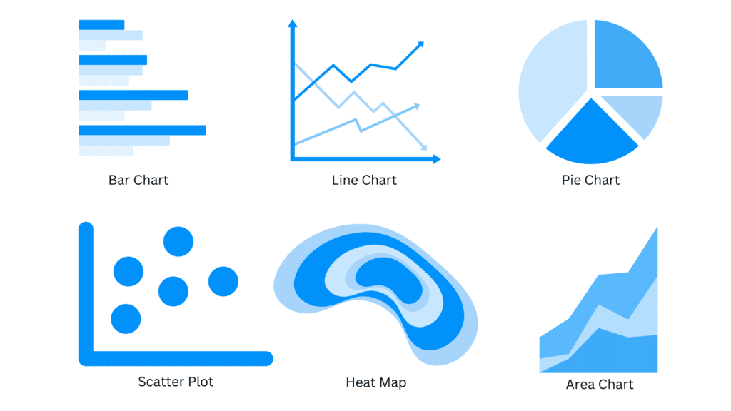
There are numerous types of data visualisation charts, each designed to represent specific types of data and insights effectively. You can choose the type of chart that best suits your needs. Here are some common types of data visualisation charts:
Bar Chart: A bar chart represents categorical data with rectangular bars, where the length of each bar corresponds to the value it represents. It is useful for comparing data across different categories.
Line Chart: A line chart displays data as a series of data points connected by straight lines. It is commonly used to show trends and changes over time.
Pie Chart: A pie chart displays data as slices of a circle, with each slice representing a proportion of the whole. It is suitable for showing parts of a whole or percentages.

Scatter Plot: A scatter plot represents individual data points as dots on a two-dimensional plane. It is used to visualise the relationship between two variables and identify correlations.
Heatmap: A heatmap uses colour gradients to represent data values in a matrix or grid format. It is suitable for visualising large datasets and showing patterns and relationships.
Area Chart: An area chart displays data similar to a line chart but with the area under the line filled. It is effective for showing cumulative data or data with multiple categories.
Best Data Visualisation Tools 2023
Now that we know the importance of data visualisation in decision-making for any industry, let us look at some of the best data visualisation tools for 2023.
Corestrat’s data Visualisation Tool
Corestrat offers data visualisation and automated data insights, enabling you to effortlessly uncover fascinating statistical patterns and address data quality issues. Enhance the precision and adaptability of your machine learning models through outlier identification, dataset splitting, and handling missing values.
Leveraging data science, analytics, technology, and our risk management expertise, we empower you to gain profound insights from your data and swiftly make profitable decisions aligned with your broader business objectives. Boost revenue by targeting the ideal customer base, ensuring identity verification, detecting fraud, optimising risk-reward balance, and achieving other valuable outcomes.
Google Charts
Google Charts is a powerful and easy-to-use data visualisation library developed by Google. It allows users to create a wide range of interactive charts and graphs for presenting data on web pages. Google Charts is based on HTML5 and JavaScript and provides an extensive collection of chart types, making it a popular choice for developers and website owners who want to incorporate data visualizations into their applications.
Tableau
Tableau is a powerful data visualisation and business intelligence software developed by Tableau Software, which was acquired by Salesforce in 2019. Tableau allows users to connect, visualise, and share data from various sources, enabling data analysis and decision-making in a visually appealing and interactive manner.
Tableau can connect to a wide range of data sources, including databases, spreadsheets, cloud services, and big data sources, making it easy to access and analyse diverse datasets.
Qlik
Qlik (formerly known as QlikView and Qlik Sense) is a leading data analytics and business intelligence platform developed by QlikTech. It enables users to connect to various data sources, explore data, create interactive visualisations, and build data-driven applications for data analysis and decision-making.
One of Qlik’s unique strengths is its associative data model, which allows users to explore data freely without predefined drill-down paths. This means users can make data discoveries and uncover insights that may not have been apparent through traditional data querying.
Power BI
Power BI is a popular business intelligence and data visualisation tool developed by Microsoft. It allows users to connect to various data sources, transform and clean data, create interactive visualisations, and share insights with others. Power BI is part of the Microsoft Power Platform and integrates seamlessly with other Microsoft products and services.
Power BI offers data transformation capabilities, allowing users to shape and clean data before visualising it. Users can perform data wrangling tasks such as filtering, merging, and transforming data within the Power BI interface.
Conclusion
In nearly every industry today, data plays a pivotal role in facilitating well-informed decision-making. However, interpreting the immense volume of data and extracting valuable insights can be a challenging endeavour. Fortunately, with the advent of modern data visualisation tools, this complexity has significantly diminished, enabling numerous organisations to efficiently gather, analyse, and interpret data, thereby enhancing their ability to make more informed and improved decisions.
Corestrat’s data visualisation tool which is a part of the Intelligent Decision Studio product suite can help you analyse any amount of data to make the perfect sense. Organisations can identify and improve trends and patterns important to your business early on while data insights and trends can be easily communicated to stakeholders using our data visualisation tool than raw data.
 Skip to content


